We sometimes see people comment that they don't get on with using a ring bound planner because the rings get in the way when writing.
I can understand this issue. For right handed people, writing on the left hand page of your open organiser can be an issue, and conversely for left handed people writing on the right hand page can be an issue.
I personally don't find it too difficult when using an A5 or bigger organiser, you tend to be writing towards the left hand margin more in those size formats. [For information, I'm right handed, my writing is bad enough without needing to make it look worse!]
Certainly in a personal size it can be an issue, especially with larger rings.
One solution I have used was to move the sections around so the diary section (the most used section) was towards the middle of the stack of pages. This means there is less of a 'jump' over the rings from one side to the other!.
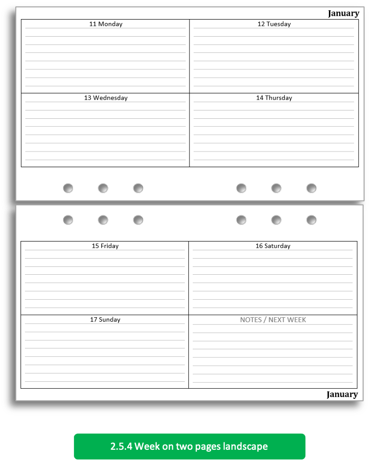
Another solution in Personal Size would be to switch to landscape pages, like this example below.
By rotating the organiser through 90 degrees to write in it solve the problem though?
Does writing on the 'upper' page become just as much an issue for both left and right handed people as it does with the pages in portrait aspect?


I have to track a medical issue, and also my sleep patterns and some medications, so I designed a 28-cell wide by 24-cell tall table to give a full 24hr-day 4-week overview, and print that onto a Personal size page. It works best in landscape, and I rest my hand or wrist on any convenient large book or similar to get the height and avoid problems closer to the rings. Probably not ideal for jotting notes in the thick of a commute. Perhaps if that's a problem, pencil to take notes in the moment, then inking in a neater version later, would work? I'm a fan of using mechanical pencils, especially for future events which could be subject to change.
ReplyDeleteI really like the Filofax month on one page with notes, in fact as I only record birthdays, anniversaries and appointments I could use it as my main diary. However I just don’t like moving my planner to landscape, it feels awkward.
ReplyDeleteAs suggested in the post, landscape for Personal (Jacket pocket Filofax, portrait for my A5.
ReplyDeleteI do like landscape leaves in personal, and find the rings less obstructive on the upper page because my hand is aligned to the rings and can partly rest between them.
ReplyDeleteBut portrait format works better for lists and a week on one page diary.
In my main planner/wallet, a pocket ring planner with 20mm rings, the rings don't bother me much when I'm writing.
ReplyDeleteOnly since this year have I also been using a calendar with more detailed entries in a personal ring planner - and this is where the rings really bothered me.
So without further ado I made myself a calendar booklet for the first 6 months with 15 sheets (30 pages).
A whole year would be too fat.
The cover is made of 250g paper, which I have additionally protected with a self-adhesive book foil.
The back cover slides easily into the left-hand, outward-facing pocket of the Holborn Personal - I also secure the calendar booklet in the
top card compartment with an öli clip.
Alternatively, the very thin memo pads from Hobonichi also fit.
Next year, however, with this additional, larger calendar, I will be moving entirely to a dated Kinbor Weekly (great, inexpensive alternative to the Hobonichi Weeks that I am currently testing) which has a great 64g paper and gives me an additional 78 pages for occasional journaling.
But if I were to use a calendar again in a personal ring planner other than the Holborn, I would definitely prefer the landscape format.