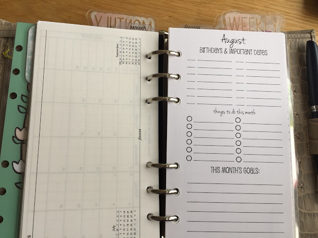
Well here it goes, a boring planner 😉
(Disclaimer: for privacy reasons I have only blank pages photographed).
I have GILLIO personal size grey mat, which I bought because I got a promotion at work. I was eying this planner for a long time and made a promise to buy it when I got the promotion. And I do not regret it.
My planning is a combination of GTD and bullet journal. And a lot of common sense and flexibility and usefulness to my daily life. My planner has 5 sections:
- Note’s
- Calendar
- Projects/ To Do’s
- Lists
- Misc.
The calendar section consist of four sections:
Yearly overview: I have the Filofax the four-year planner overview, where I put in school holidays’ and other school-related stuff for my kids.
Monthly overview: it is the month on one page and in between, I have a month overview where I put in all the important dates, to do’s for the month and goals.
Weekly: I have a week per page with notes. I put here all my appointments for the week, together with the to do’s for that week and some reminders/notes for the week. I also screen my month pages to see if there are things that I need to tackle in the week.
Daily’s: I bought these on a discount (90%!) somewhere in January this year. Even if I do not use it, it is cheaper than printing daily pages 😉. I put here all my appointments, to do’s, etc. for the day. At the end of the day, I screen the page and see if all has been done and/or need to be transfer / reschedule to another day. I kinda use them in a bullet journal style.
After the calendar section, I have my project / to do’s. I have here a master to-do list for the month. All the to do’s during the month are being placed here. From here I put the 'to do’s' on a relevant day that they need to be finished.
I also have my projects here, divided into a small task with there due date. I use just plan graphic paper for this. Nothing fancy.
Next, I have all my list. And this why I love the ring planner. I can take my list every year with me, without rewriting everything. My lists are:
- Running schedule: I am training for the 10 Miles in June this year.
- Addresses
- General information
- Website information
- Work instructions: hmmm need to rethink about this section…
- Finance
The last section is a (Daytimer) pocket that I trimmed to fit in the planner. I have this many, many, many years now. I put their stuff: stamps, nice mandala, writing board. Just stuff, that actually needs to go somewhere else……
As you can see, I find my planner cute, but functional. And while writing this piece I am already thinking that some sections need to find another place.
And now it is your turn: show me your planner 😊.
Thank you Maria for this excellent peep in to your organiser. As she says.... let us see yours... please contact steve at philofaxy dot com


What a lovely and practical set-up! Thanks for sharing it.
ReplyDeleteThank you so much!
DeleteThank you so much for your nice comment.
DeletePretty and functional :) thanks for sharing
ReplyDeleteThank you so much for reading it.
DeleteWhat a great post. Thanks for sharing your planner!
ReplyDeleteThank you for the nice comment. You are welkom.
DeleteWhat a beautiful and eye-pleasing organiser! Functional,very feminine and colourful without girlish embellishments and distracting decorations. Thanks for sharing. I have come back to look at the lovely pictures and read about your sections for about a fourth time today and will come again.
ReplyDeleteThank you! I have had this set up for years now. I have changed, but keep coming back to this set-up. This works for me. I am not a girly embellishment person. Those are nice, but for me it does not work, as my planner is also in meetings at my work. So it needs to be crisp, clear and I need to find the information that I need. I like a touch of color, but that sit.
DeleteHi Maria
ReplyDeleteWhat a great setup! Thank you for sharing. Where did you get the monthly important dates/monthly goals pages? From the fonts they look like they could be from Paperchase, or maybe an Etsy purchase?
Also, do you remember where you bought the daily pages? I might look for the 2020 version whew it's titi to buy for next year.
Finally it would be great to have some of those top tabs which you use to separate your yearly/monthly/daily pages......did you make them yourself or where did you buy them?
Sorry for so many questions! I love your setup, and thank you again for sharing ��
Hi David,
Deletethank you for the comments and questions. Really appreciated.
The monthly overview is from SewMuchCrafting. Se is on both Etsy and has her own shop. Philofaxy has something similar: https://philofaxy.com/files/Monthly%20Plan%202014%20v1%20single.pdf.
My daily pages are from the branch Succes. You can buy them online at Appelboom (https://appelboom.com/). The paper quality is not fountain pen friendly. For the price I paid, I can use an other pen ;).
The top taps I have from MomdaylifeDesigns (Etsy). I have three sets: this one, which is more of a Spring color, a white one, which is both summer and winter and a autumn colored one.
If you have any questions, let me know.
Hi Maria
DeleteThank you so much for all this detail 😊
Very nice photos!
ReplyDeleteVery nice setup, thank you.
ReplyDelete