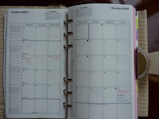
I really like the Month on 2 Pages (untabbed) Filofax insert. I love having that extra column before Mondays to make notes. I also like that they DON't cut any days in half at the end of the month, and instead they have a standard 6-row format. Instead of leaving any squares blank, they fill in the days in the previous and/ or following month to complete each weekly row. This helps me with my "beginning of the month problem" which is when I think, "Oh I've got loads of time to prepare for X event, that's not until next month!" No, that's next WEEK.
Like I said, I really like this setup. But, I needed to do just a slight tweak. Having a standard 6-row format every month doesn't let me see the "shape" of the month. I like to be able to see at a glance what day of the week the first/ last day of the month falls on, and seeing the shape of the month also helps me in some way I can't quite figure out.
So, I outlined each month with a pen, which you can see in my photo at the top of this post. I chose October because it had the least amount of personal stuff written in. But, you can still see my birthday indicated (mark your calendars!!!!!).
I prefer the weeks to begin on Mondays (since my weekly planner weeks begin on Mondays, and to keep the weekend days together) but I know some people (especially in the US) prefer a Sunday start. I've seen monthly calendars that combine Saturday and Sunday into one square, to have 6 columns instead of 7 or 8, but I need the weekend days to each have their own square. I prefer 8 columns, with the extra column for notes.
How do you like your monthly calendars to appear?


i always liked the tabbed month on two pages. for a while, i even used them as my index tabs for a while. the only issue was that i had to buy to packs since the months are printed on both sides.
ReplyDeleteI've never understood why the tabbed months are printed back to back. Makes the tabs almost entirely useless.
ReplyDeleteLOL, I was going to comment, "I prefer my month on 2 pages TABBED" but didn't want to, you know, complain.
ReplyDeleteSo glad you guys brought it up : )
FF does have a tabbed monthly diary but it's laid out strangely. I use it in my financial planner to track when bills are due, but it's almost useless. Can't see how the month lays out AT ALL.
Laurie did you see the comment on Twitter about your outline, it has been passed on to the design department!!
ReplyDeleteSteve I did see that, and I replied that I want to work in their diary design department!!!
ReplyDeleteNow I wish I'd posted a nicer photo than this scrawly-line one. Since that time I've lined the rest of the months for 2010 and all of 2011, using a RULER this time, and it looks much nicer!
Laurie, I do the same thing with my monthly view, though I use a yellow highlighter. The pencil lines would never be enough for me. I agree that they would be better tabbed. But I have come up with a work-around in the meantime. I use two page markers - a clear one for the current month and a black one for my current week. Then I use the monthly tabs for the rest of my weekly pages since there's more of them which results in more searching for a specific date. The monthly pages are kept before my weekly pages, so the clear page marker allows me to see the black page marker easily. It's not the best system and there's a lot of flipping back and forth but since none of us has found "the prefect planner," it's all about what's good enough at the time. =)
ReplyDeleteI've taken the liberty of adding your birthday to my calendar ;)
ReplyDeleteYes! I agree that months should be 'highlighted'. It's also what I used to do with my work calendar which I would print from Outlook, and I also am the 'week-starts-on-Monday' type. Sundays are such a drab, it'd be even more depressing to have them be the start of the week in my head.
Oh and KUDOS! on having gotten this prayer answered by Filofax!!!
The eight columns (one for notes) sounds great to me; it would be perfect for things you know will take place some time that week, even if you aren't sure of the exact day at the time you put the event in your planner.
ReplyDeleteI agree RE: the 'shape' of the month; if I were designing this insert, I'd probably go for a lighter colour in the 'fill-in' boxes (say, September 30 on the October Mo2P), and maybe outline the month too. Franklin Covey could probably come up with a million beautiful templates for this!